01Navigation
Before
A general “Shop” entry grouped the assortment.
After
Oat Bases, SuperLattes, Daily Rituals, bundles and starter kits are accessible directly from the main menu.
Visitors can choose their product category immediately.

Case Study / BlueFarm / Shopify
What changed in the BlueFarm relaunch? Compare the previous store with today’s version, from finding the right product to choosing a one-time purchase or subscription.
01 / First impressions
The new structure brings product categories into the navigation. Individual products, prices and purchase buttons follow on the homepage. These are real screenshots of both versions.
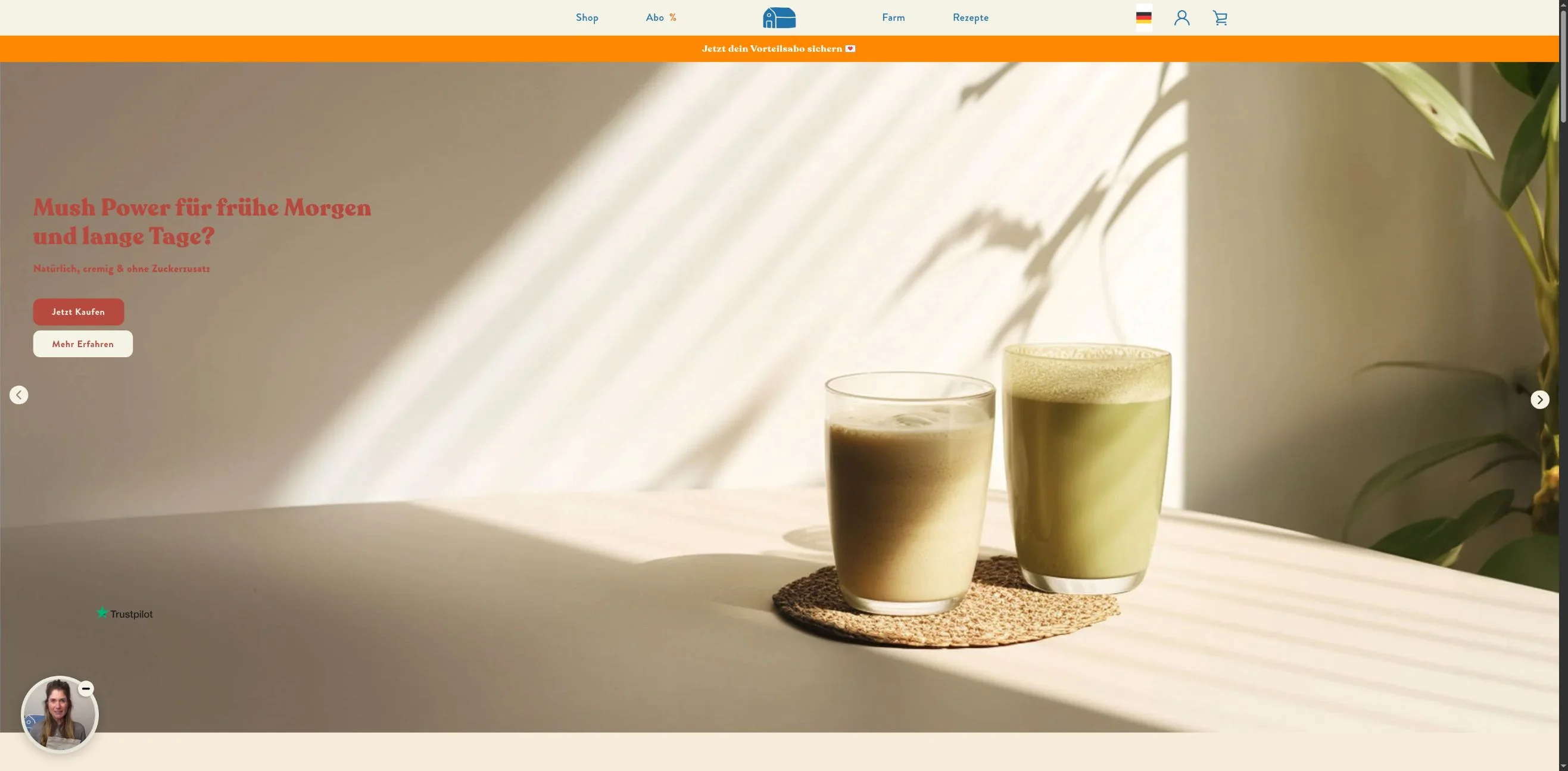
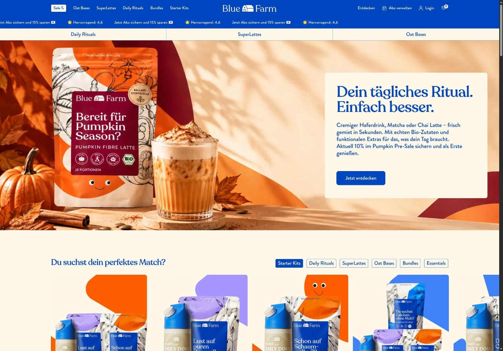
Click the images to enlarge. Captured on 24 September 2026: the previous theme and the current live store. Promotions, assortment and product imagery may have changed since the relaunch.
02 / What changed
Existing features were reorganised and expanded. Here is how orientation, selection and product explanations differ for visitors.
A general “Shop” entry grouped the assortment.
Oat Bases, SuperLattes, Daily Rituals, bundles and starter kits are accessible directly from the main menu.
Visitors can choose their product category immediately.
Category tiles linked to collection pages through “View products”.
A product section with category tabs shows individual products, prices and purchase buttons.
Product selection starts on the homepage.
The homepage introduced the brand through natural ingredients, taste and sustainability.
An additional needs-based section links energy, relaxation, immunity, digestion and enjoyment to relevant products.
Another entry point for visitors who do not yet know the range.
Quantity, pricing and purchase type appeared across successive sections. A subscription with a 15% discount already existed.
Quantity, purchase type, delivery interval and prices are grouped in one purchase panel. “Cancel anytime” appears beside the subscription benefits.
Options and conditions can be compared in one place.
Product details, nutrition and allergens shared one entry point.
An Ingredients entry and separate sections for product information, nutrition and ingredients, allergens, shelf life and packaging organise the answers.
Visitors can jump to the product question they need answered.
Trustpilot, organic/vegan seals and product benefits were already present.
Rating, Ingredients and benefits sit near the product title. The current gallery also shows preparation and use; the homepage includes expert voices and product-linked videos.
Product explanations and trust signals accompany the selection.
03 / Pure Oat Base
The same product makes the change tangible: the current purchase panel groups pack size, subscription, delivery interval and one-time purchase. Prices sit beside each option, with cancellation terms beside the subscription benefits.
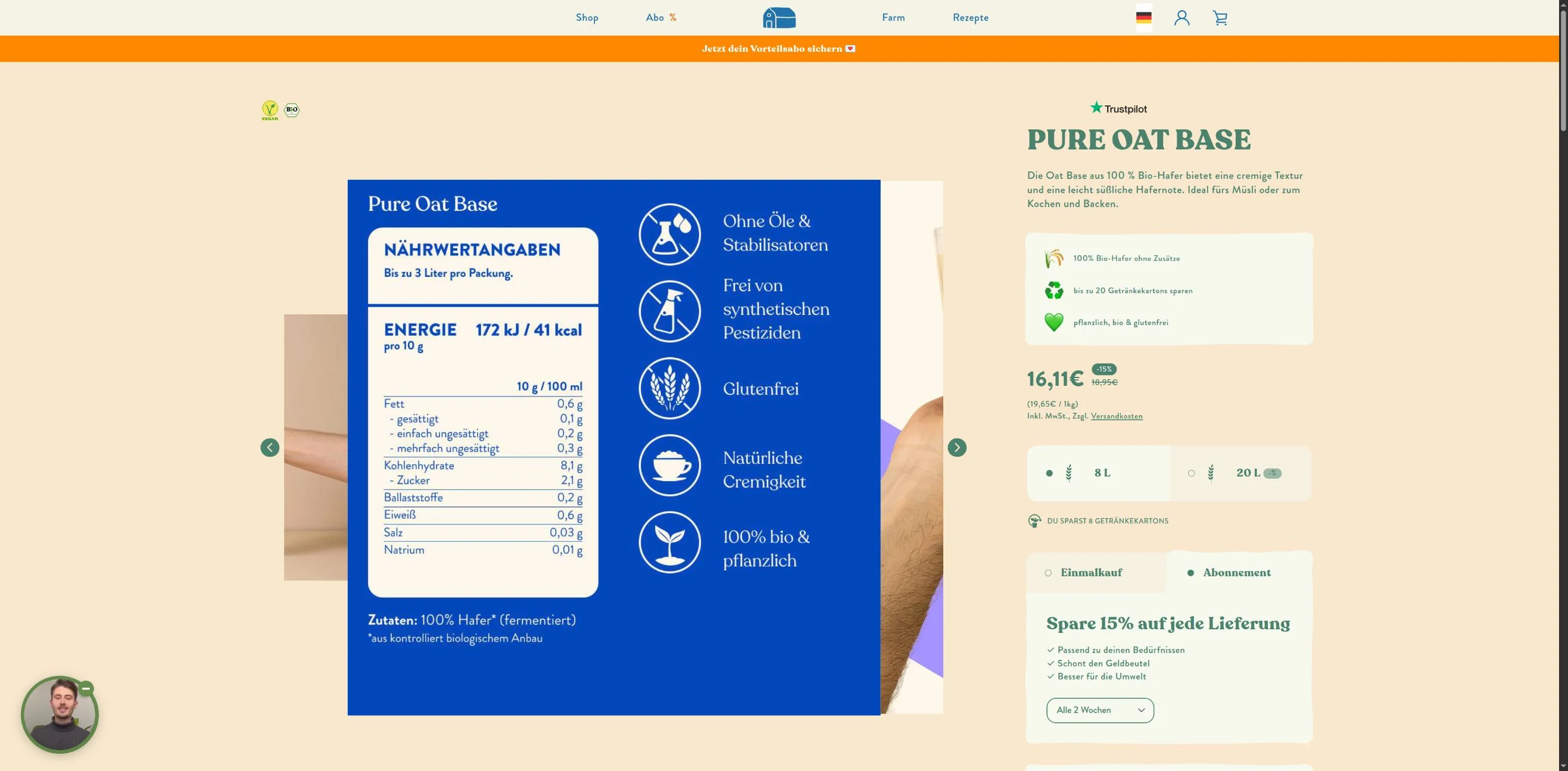
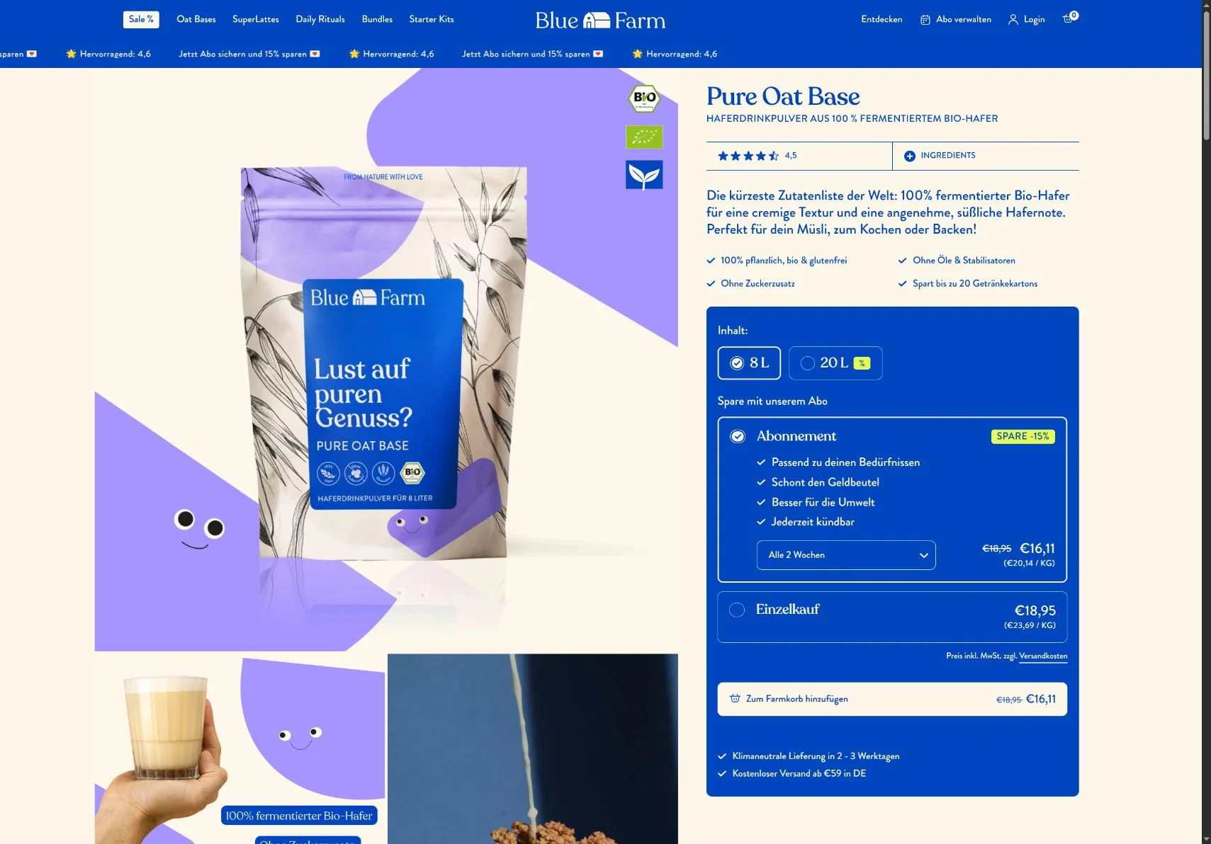
Both versions show Pure Oat Base. The previous theme already offered subscription selection and a 15% discount; the change shown here is the presentation and grouping.
04 / The result
CrossBox rebuilt the BlueFarm store in four weeks. After go-live, the conversion rate was 20% higher. The screenshots make the design and shopping experience tangible.
20% is a relative increase, not 20 percentage points. The figure applies to the overall relaunch. The visual comparison alone cannot determine how much each individual change contributed.
Visual comparison: the client-provided preview of the previous theme and bluefarm.co, reviewed on 24 September 2026. The preview uses current store data and is not a frozen historical dataset. The six points describe visible interface differences. The result and project duration follow the existing CrossBox project summary. Visit the current store ↗